RCSS Logo Competition
Posted on 22 August 2013
RCSS Logo Competition
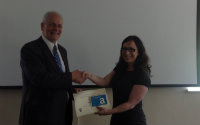
The RCSS announced a competition for students across all the Social Sciences to design a logo for the new Research Centre in June. The winner of the competition was Kim Witten from Language & Linguistic Science who won a £50.00 Amazon voucher. This was presented to her by the Vice Chancellor, Professor Brian Cantor, during his visit to the RCSS building.
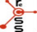
Kim explained that the RCSS logo is a simple 2-colour design with a graphic element that symbolises many aspects of the social sciences. The orange icon, branching off of the 'c' in "Centre", can represent a network or the notions of connectivity and growth. It is also reminiscent of a hub, as shown on many of the navigation signs leading the way to the RCSS and other centres in the Science Park. The orange colour used in this graphic element was intentionally chosen to stand out from themes of blue and green, which are commonly seen in the social sciences. This also serves to complement the colour palettes used in the logos and themes of the RCSS' many collaborators. The lower-case letters in a simple and understated font are purposefully arranged in a vertical format, allowing the words these letters represent to be read properly when added to the logo design. All of these elements combine to help create a sophisticated and meaningful image for the RCSS, carrying forward the tradition of innovative research upon which the centre is founded.
|
  |