Florence Nightingale's Statistical Diagrams
By Hugh Small. Paper from Stats & Lamps Research Conference
organised by the Florence Nightingale Museum at St. Thomas' Hospital,
18th March 1998. Hugh Small is the author of Florence
Nightingale: Avenging Angel published by Constable
It has been said that Florence Nightingale was the first to use diagrams
for presenting statistical data. This is not true, of course, but she
may have been the first to use them for persuading people of the need
for change.
Edward Tufte does not mention Nightingale in his book on the history of
graphics1, and he says that this famous
1869 chart by Minard of Napoleon's dwindling army as it marched to
Moscow and back in 1812/13 may be the best statistical graphic ever
drawn:
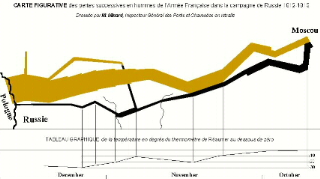 Minard's diagram includes a temperature chart which misleadingly
suggests that Napoleon's army froze to death. It shows the falling
temperature during the retreat from Moscow, but most of the army was
lost during the advance (300,000 men, vs. 90,000 in the retreat).
Nightingale herself studied this catastrophe, and concluded that
Napoleon's army - like most others - had died of disease2.
Minard's diagram includes a temperature chart which misleadingly
suggests that Napoleon's army froze to death. It shows the falling
temperature during the retreat from Moscow, but most of the army was
lost during the advance (300,000 men, vs. 90,000 in the retreat).
Nightingale herself studied this catastrophe, and concluded that
Napoleon's army - like most others - had died of disease2.
Like Minard's, Nightingale's most famous graphics illustrated what she
called the "loss of an army" - the British army sent to the Crimea. She
published them ten years before Minard's. Hers also were more topical
and conveyed a call to action - they were prescriptive rather than
descriptive. She used recent data to persuade the Government to improve
army hygiene.
Although she was before Minard, there were others before her. The
best-known pioneer of statistical graphics was William Playfair, who
published what must be the first "pie chart" in 18013. It
was in a graphic showing that, by comparison with other countries, the
British paid more tax. The vertical line to the left of each circle is
the population (left scale) and the vertical line to the right is the
tax revenue (right scale). In this selection of four of Playfair's
countries, Britain is the only one in which the tax line is higher than
the population line:
 Playfair used this graphic to argue for lower taxes. So you could say
that, unlike Minard, his graphics are prescriptive. But Playfair's
graphics are merely comparisons. They do not demonstrate what would
happen if you reduced taxes. They look good but make you ask "so what?"
They do not illustrate cause-and-effect - what Nightingale called a
"law".
Playfair used this graphic to argue for lower taxes. So you could say
that, unlike Minard, his graphics are prescriptive. But Playfair's
graphics are merely comparisons. They do not demonstrate what would
happen if you reduced taxes. They look good but make you ask "so what?"
They do not illustrate cause-and-effect - what Nightingale called a
"law".
Before going into Nightingale's graphics, let's look at the state of
statistical science in her day. There was a great revolution in this
area in Nightingale's time. In 1837 the General Registry Office at
Somerset House, led by William Farr who later helped Nightingale with
her Crimean statistics, began to systematically record births, deaths,
and marriages in the UK. This gave people the opportunity to examine
new cause and effect relationships using registration statistics.
The years of struggle and the visit to Kaiserswerth
For example, Florence Nightingale and her sister Parthenope attended the
1847 meeting of the British Association for the Advancement of Science
in Oxford. There, they may have seen a report from a Government
Actuary, F G P Neison, which showed that counties in which people
were better educated had a lower crime rate. This was an argument in
favour of higher taxes to finance public education, countering the
propaganda of Playfair against high taxes. Neison knew that opponents
of his theory would claim that it was prosperity, not education, that
reduced the crime rate. So he found counties that had both a relatively
high income and a relatively low education, and showed that at least a
part of the variation in crime rates was due to education:
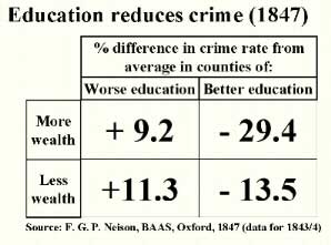
Neison estimated the level of education in each county by counting the
proportion of people getting married there who were able to write their
name on the marriage certificate. Statistics relied much more on
ingenuity and less on complicated formulae in 1847!
Social improvers like Florence Nightingale eagerly seized on results
like Neison's which showed how mankind could combat social evils. Part
of her interest in statistics was related to her Unitarian faith.
Unitarians believed that mankind has the power to continuously improve
itself by observation and the use of reason.
After the Crimean War (1854-56), Nightingale created a number of
spectacular graphics designed to show how improvements in building
hygiene could save many lives. These appear in five different
documents:
- Appendix 72 of the report of the Royal Commission that Nightingale
organised after the war, published in 1858.
- Mortality of the British Army (1858), a private edition by
Nightingale of the above Appendix, with exactly the same content but
with better layout than that used by Government printers. She produced
2000 copies of this book.
- A Contribution to the Sanitary History of the British Army
(1859). Nightingale published this anonymously to answer a
pamphlet4 that claimed that she had
exaggerated the number of deaths in the war. She showed that the Army's
own figures, released in late 1858, showed that on the contrary she had
underestimated. The graphics in the Contribution used the same
statistics as in No. 2 but with different graphic presentation, as we
shall see.
- Notes on Matters Affecting the Health of the British Army
(1858). This was a confidential report to the Government, that
Nightingale printed privately and sent to a number of people. This
contains two of the three graphics from No. 3.
- England and Her Soldiers (1859) by Harriet Martineau.
Nightingale encouraged Martineau to write this book about the war and
gave her copies of the graphics used in No. 3.
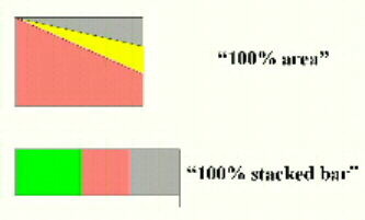
Most of the graphics used in Nos. 1 and 2 are similar to those
previously used by her adviser William Farr in his Registrar-General's
Annual Reports. They are mostly what we might call "100% area" or "100%
stacked bar".
There is also one "honeycomb" graphic showing how densely soldiers are
packed in camp (a device which Farr had already used for illustrating
urban density), and two other graphics that are highly original. The
first is what Nightingale called the "bat's wing" which is very gloomy
to look at and also misleading.
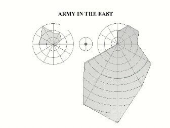
The circle on the right has 12 sectors going clockwise representing the
first 12 months of the war. The circle on the left is the second 12
months. The superimposed dark shapes show the monthly death rates. The
diagram illustrates how the Sanitary Commission, sent out in the middle
of the war, dramatically reduced the death rate.
The length of the radial line in each month is proportional to the death
rate, but both the text and the appearance imply that it is the shaded
area that is proportional to the death rate, rather than the length of
the radial lines. Florence recognised this error and inserted an
erratum slip, but then replaced this diagram in later documents (nos. 3,
4, and 5 listed above) with what I will call the "wedges" diagram.
This "bat's wing" and its successor are so different from any diagrams
that Farr did before that they may be Nightingale's own invention. The
other highly original chart is what I will call the "Lines" - a bar
chart showing how soldiers in peacetime, living in their barracks in
England, were dying at a faster rate than civilians in the cities around
them.
There is a black bar in each of four age ranges, and a longer red bar.
The black bar is the number of civilians who die each year, and the red
is the number of soldiers. There are a number of curious overtones to
this graphic, which may just be a coincidence.
First, the title "Lines" (in ornate script in the original) makes it
sound like a poem, as in Lines on the Death of Bismarck.
There are four pairs of bars, when actually the message is clear from
one pair alone. There seems to be a kind of repetition, as in a chorus.
This effect is increased by the words, repeated at the end of each
line, English Men, English Soldiers ... It sounds like a funeral
march.
Second, the red bar for the soldiers would certainly make some people
think of the "Thin Red Line" which had become famous in the Crimean War
when a two-deep row of red-jacketed British infantrymen stopped a
Russian heavy cavalry charge, something that was thought to be
impossible. The thin red lines on Nightingale's chart represented these
same heroic soldiers who were now dying unnecessarily because of bad
hygiene in their barracks.
Perhaps this graphic is a visual poem by Arthur Hugh Clough, who was
Nightingale's secretary at the time that she produced it5.
The variation of death rates due to differences in hygiene was very
important to reformers like Nightingale because it showed that even the
civilian death rate could probably also be improved by better
hygiene. One of Farr's rules of thumb was that if something varied
widely from place to place, it could probably be reduced to zero. This
is an example of the army being used as a controlled environment for
testing social theories, which was very common in Victorian times.
This "Lines" graphic is probably the most influential of Nightingale's
diagrams because it dealt with a situation that was still going on. The
"bat's wing", on the other hand, described a wartime catastrophe which
was now history so that the army could claim that it wouldn't happen
next time. It was probably the "Lines" diagram that Nightingale
particularly wanted to frame and send for hanging in the offices of the
Army High Command, as a rebuke6.
However, it is the last graphic - the successor to the "bat's wing"
which I will call the "wedges" - that Nightingale is most famous for.
Strangely enough, the name that many people give it is wrong. This
graphic is not what Nightingale referred to as the "coxcomb"!
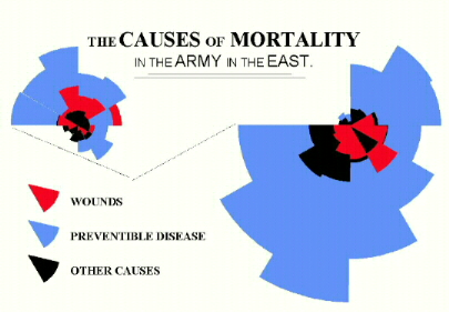 In this diagram, Nightingale resolved the problem of the "bat's wing" by
using areas to represent the variation in the death rate, instead
of the length of radial lines. The blue wedges, representing death by
sickness, are far bigger than those representing wounds. The message of
this graphic is twofold: first, most of the fatalities during the war
were from sickness and second, improvements in hygiene dramatically
reduced the death rate.
In this diagram, Nightingale resolved the problem of the "bat's wing" by
using areas to represent the variation in the death rate, instead
of the length of radial lines. The blue wedges, representing death by
sickness, are far bigger than those representing wounds. The message of
this graphic is twofold: first, most of the fatalities during the war
were from sickness and second, improvements in hygiene dramatically
reduced the death rate.
Nightingale used this diagram instead of the "bat's wing" in documents
3, 4, and 5. But why do I say that this is not the "coxcomb"? What did
Nightingale mean by the word "coxcomb"?
A coxcomb is the ostentatious red crest on the top of a cockerel's head.
Nightingale used the word to describe the 2000 copies she had printed
of No. 2 - her Mortality of the British Army. This booklet, a
reprint of an annex containing diagrams, text, and tables, was the
"coxcomb" of the enormous Royal Commission report, the colourful and
ostentatious part that people would actually take notice of. In her
letter of Christmas Day 1857 to Sidney Herbert (the President of her
Royal Commission) Nightingale used the word "coxcomb" in this more
thoughtful sense, referring to a book consisting of text, tables, and
graphics:
"Dear Mr. Herbert,
I send you one of the "coxcombs" There are
300 of these
1700 of the vulgar sort
2000
I have also the proof of the Appendix copy of it for your report. In
this form, printed Tables & all in double columns I do not think anyone
will read it. None but scientific men ever look into the Appendix of a
Report. And this is for the vulgar public. The only good of having it
in the Appendix at all is for the sake of the last line on the cover of
the coxcomb: "Reprinted from the ... [sic]"7
She never used the word to refer to a diagram. The "coxcomb" booklet
that she was referring to in December 1857 did not even include the
colourful "wedges" diagram, because that didn't appear until late in
1858. The booklet to which she was referring, published at the
beginning of 1858, included the old bat's wing diagram which was
erroneous and which she replaced by the wedges later that year.
Sir E T Cook's biography of Nightingale in 1914 first used the word
"coxcomb" for the late 1858 "wedges" diagram:
"England and her Soldiers, by Harriet Martineau, 1859. Miss
Nightingale's "coxcomb" diagrams were reproduced in this
volume..."8
It is easy to see why the error has persisted: the diagram resembles the
crest of a helmet.
In briefly surveying Nightingale's statistical diagrams this paper is
guilty of the superficiality which Nightingale predicted, because it has
focused on the coxcomb of her report and ignored the real issues of
substance. For example: was her conclusion justified? Did sanitary
improvements reduce the mortality, or was it the reduction of trench
duty as some army doctors claimed? And the most important question of
all: did she achieve real success with these arguments, in terms of
reducing the mortality of the population as a whole?
These questions will eventually be answered by a more thorough
evaluation of material in Nightingale's archives and elsewhere.
- The Visual Display of Quantitative Information. Graphics Press UK,
P.O. Box 8, Godalming, Surrey, GU7 3HB
- BL Add. MSS 43394, f116
- Playfair, William, The Statistical Breviary, London, 1801
- [Hall, Sir John, and others] Observations of a Non-Commissioner,
n.p., n.d. [1858]
- Mulhauser, Frederick L., The Correspondence of Arthur Hugh Clough.
Oxford: Clarendon, 1957
- Bishop, W. J., and Sue Goldie, A Bio-Bibliography of Florence
Nightingale. London, 1962
- BL Add. MSS 43394, f210. 25/12/1857. ff 215 and 219 also refer to
the "coxcombs" as books. Appendix 72 of the Royal Commission report was
printed in double columns, but her Mortality of the British Army is
single column. From her letter, it appears that there were 300 deluxe
copies.
- Cook, Life of Florence Nightingale, vol. 1, p. 386. Possibly the
only book which more correctly associates the word "coxcomb" with the
"bat's wing" diagram is Sue Goldie's Florence Nightingale in the Crimean
War (1987), p. 94.
The Florence Nightingale Museum Trust, 2 Lambeth Palace Road, London
SE1 7EW, 1999